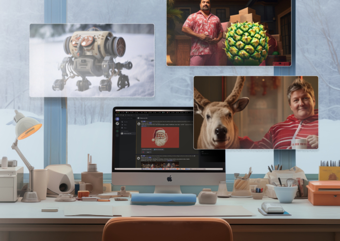
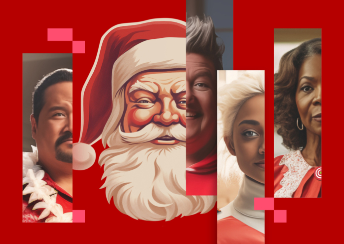
Saturday, 14 August 2010

Come work hard and, um…fly right the friendly skies?

United NewsReal August 12, 2010

New Visual Brand Identity for the New United Airlines

Today, United and Continental revealed refinements to the visual branding for the new global airline that will result from the proposed merger.

The new logo displays the proposed company’s brand name – UNITED – in capital letters and in a more contemporary, sans-serif font, joined with the globe which has represented Continental’s brand since 1991.

A corresponding update of the proposed airline’s aircraft livery will adopt Continental’s livery, colors and design, including its blue-gold-white globe image on the tail, combined with the new-style UNITED name on the fuselage. To see the new logo and livery, go to UnitedContinentalMerger.com.

The new brand logo and aircraft livery acknowledge the legacy of both carriers and advance the brand image for the new airline.

After the merger closes, the new logo will be adapted, using certain guidelines, for use on printed materials, signs and related items. We will not begin using this logo until after the merger closes.

Whereas my earlier comments regarding the merged identities of United and Continental suggested that there was nary a designer in the room, this time around, it seems they went out and found one. And then sat down next to him/her and beat them over the head until they did exactly what they wanted: The mechanical “blue-gold-white globe image” (is that what it’s really called?)—combined with a “custom” bold extended sans serif font (Now there’s an idea).

These guys are clearly confused. It’s bad enough that the logotype is a bust, but beyond that has anyone stopped to think that after this identity folds in a year or two, that United could be flying up to five different liveries (here’s four)? That extends to signage, onboard product, furniture and everything else that, in the best case scenario, gets “refreshed” every 5 years or so. Get ready for a mess.

Looking at it that way, this mash-up of an identity might be the least of United’s branding worries—and at this rate Saul Bass’ “Tulip” will be back by next Thursday.

Add a comment

Posted in Design

Previously...

New Mexico: “Land of Enchantment”—and Resourcefulness

On a recent trip to New Mexico, I was struck by the ingenuity of the locals to decorate their barren (though transcendental) terrain.

Iceland: Land of Elves and Fairies

A few glimpses of the remote beauty and quiet strangeness that I encountered on this mystical island nation.

Designing the Design Relationship

An insider’s tips for getting the most from your creative partner

Strasbourg: Streetscape

Which one do you think was built first?

Marina and Me: Impressions of The Artist is Present

I never “got” performance art and didn’t think I ever would. For all the other skeptics out there, let me set the record straight: I couldn’t have been more wrong.

Say What?

Agree? Disagree? Got another angle? or by commenting on our posts.

Search Sayso

Subscribe