Designer at large: subway service signs
In our “Designer at Large” series, Thinkso designers address design issues they’ve come across while out and about.
Confusing signage is endemic to the New York subway system, especially during track maintenance. The “Planned Service Changes” sign is a nightmare for commuters and tourists alike — particularly cryptic cases like this one.
It doesn’t have to be. Several members of the Thinkso team have been itching to redesign the subway signs, including senior designer Tyler Fortney. A Park Slope resident who commutes to Thinkso’s Manhattan offices each morning via the F train, Tyler is the perfect man for the job.
Read on for an interview with Tyler to learn what he’d do and see the big reveal.
What are the problems with the existing subway signs?
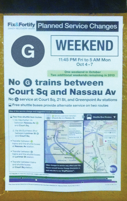
1. Lack of Good Information Architecture. If the first thing you see is “no trains at this station,” or “no trains between X and Y stations,” you might immediately freak out. The message is not connected with the dates and times, which are wordy and small, and therefore hard to read. In the case of these signs, the rider needs to know the “when” before the “what,” so the “when” needs to be featured more prominently.
2. Clutter. There are simply too many things going on at once. The dates are completely buried; the bullet points are too wordy; and the information doesn’t tell you how to get to where you need to.
3. Redundancy. The clutter exists because a lot of the information is redundant. For instance, the “Planned Service Changes” headline is unnecessary because if you see one of these posters, you immediately know that something’s up. The moon icon, which appears on a lot of these posters, isn’t really necessary either, especially because the service changes apply to weekends too — not only nights.
4. Visual Aesthetics. There are several problems with the layout and design of the poster. Each train line has a designated color — so why use black icons when we can use colored ink? (I’m assuming they’re doing this to save on cost, but they are using some color — perhaps a pre-printed master sheet. Technology is such that it would be just as cost-effective to do away with the pre-printed masters and instead run these off on a color copier.) Moreover, the fact that some headings are in all caps (and others in bold) distracts readers from the actual information about the train.
How does your redesign address these problems?
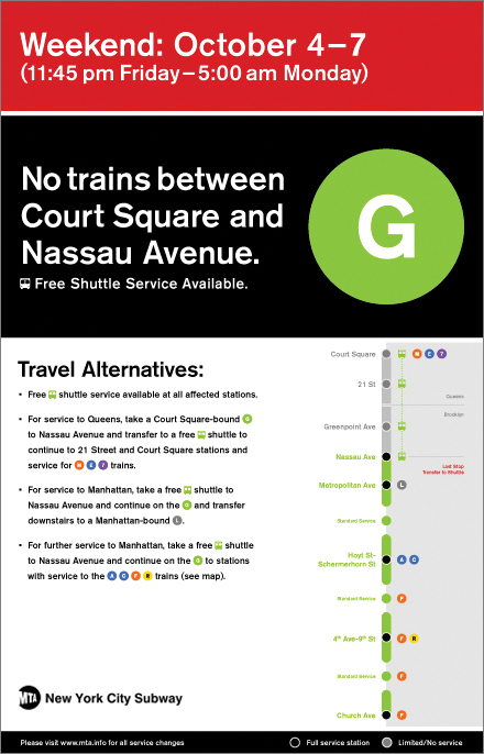
The MTA posters are not supposed to be promotional; they’re supposed to be informational. To make these posters easier to understand and use, I had to first strip out unnecessary information and confusing graphics.
I created a red backdrop for the date and time and eliminated the “Planned Service Changes” heading. The bold red color identifies the sign as an alert — eliminating the need for explanatory text. Putting the date and time up top links it directly to the service change copy (set in the same font and point size) right below it.
Next, I modified the “Weekend” heading. Rather than bold or capitalize certain headings, I tried to state the essentials — the time and date, the train line(s) and stations affected, and travel alternatives — in a clear and consistent manner.
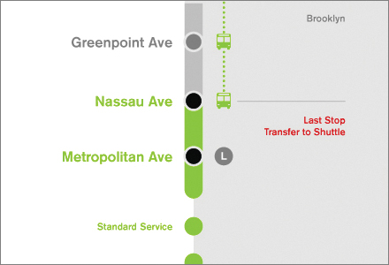
Finally, I wanted to make sure it was clear to the viewer which trains were affected and how they were being affected. Because the trains follow a linear journey, I didn’t think it was necessary to include the whole map of New York. Instead, I added a few touches to simplify the map:
- A linear map of the train line(s) being affected
- An ellipsis system to denote standard service between stations
- Greyed-out stations to signify inactive/bypassed stations
- Colored icons and corresponding colored train lines
- Clear visual demarcations between Queens and Brooklyn
If you read the reimagined signs in one pass, I think you would know what was happening.
What is the design concept behind these designs? Could you elaborate on your formatting and use of spacing?
I referred to the 1970 MTA subway style guide for the original typography, icons, and arrow styles.
In the new designs, the big headlines are four times the size of the body copy. The “Weekend” header is three times the size of the body copy. I used different proportions so that nothing looks too confusing. And I made the spacing consistent throughout.