5 myths about logo design
Working with a designer to create a new logo can be a fun, exciting chance to affirm your company’s identity and clarify its core values and message. It can also be stressful. For organizations big and small, an identity change represents a considerable investment. And because it’s something that a marketing manager may only be involved with once or twice in the course of his or her career, it’s important to be well-informed.
To help, we’ve deconstructed five common myths about logo design.
1. “My logo must directly reference my business’s product or service. Otherwise people won’t get it.”
As with any visual or verbal communication, your logo becomes stronger when it hones in on those one or two attributes inherent to your brand’s personality and philosophy that truly make your brand special. The most successful logos do this in creative or unexpected (read: less literal) ways.
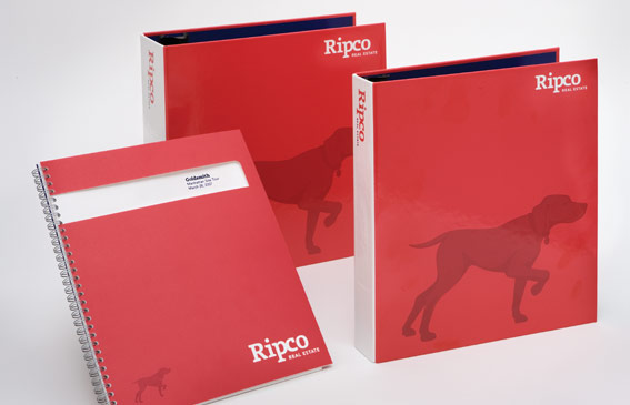
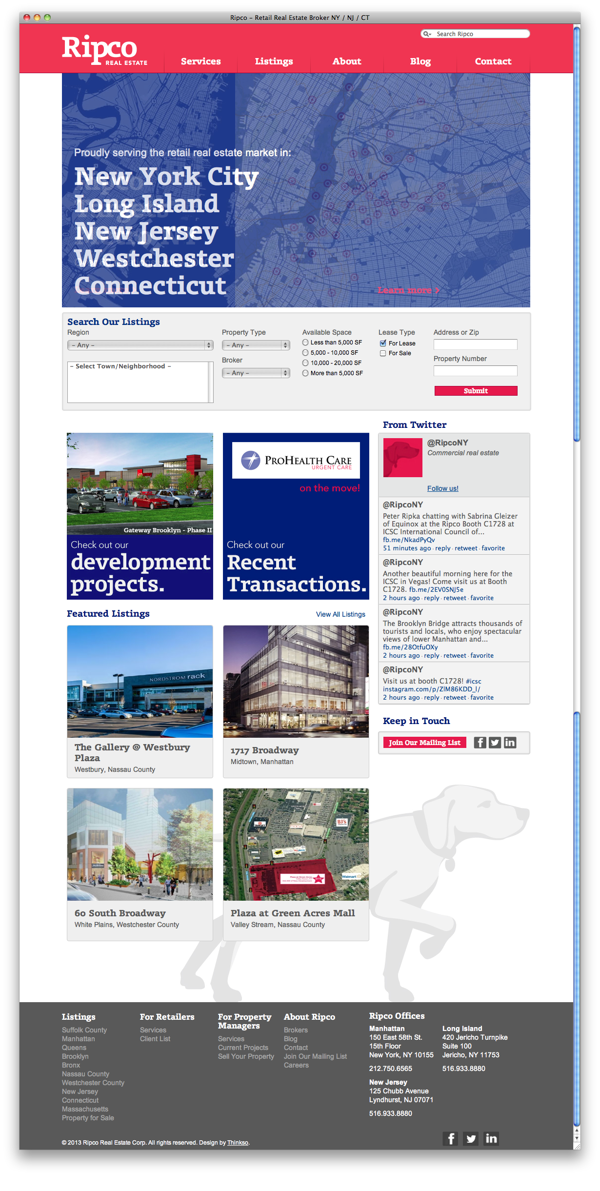
Example: Ripco Real Estate
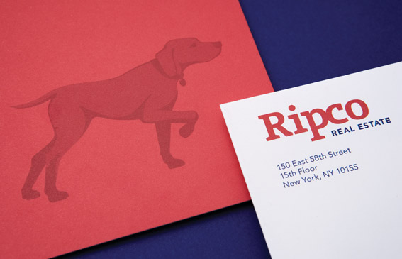
When rebranding Ripco Real Estate, a tristate area brokerage specializing in commercial properties, Thinkso avoided the well-beaten path of real estate visuals (e.g., rooftops, skyscrapers, and architecture) and instead drew inspiration from Ripco’s company origins and business philosophy. Never losing sight of its humble beginnings, Ripco had developed a reputation for dependability and honest work
To reflect Ripco’s friendly, distinct personality, we centered the identity around an illustration of a hunting dog — one that is loyal and focused on locating the prize. The dog symbol is accompanied by a simple word mark set in a sturdy serif typeface.
2. “To really be effective, I’ll need an attention-grabbing symbol. Type just isn’t enough.”
Don’t be afraid to consider a typographic treatment for your logotype. Very successful brands in a variety of industries — from Tiffany and IBM, to Bloomingdales and JetBlue — rely on simple typography to represent their brands. A typographic logotype can work extremely well, especially when it is combined with other visual elements as part of a larger identity system.
Examples: Dr. Morrison, Hobo, and Ma’yan
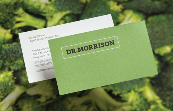

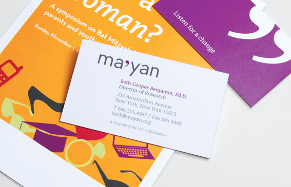
These logos from Thinkso’s portfolio show that typographic logos can be packed with meaning and personality.
3. “If I can come up with an amazing logo, everything else will take care of itself.”
As the principal identifier for a brand, a good logo is very important. However, just as no one would expect a car’s hood ornament to guarantee flawless automotive design, neither does a logo make a brand. A logo is just one element within an identity system. To be successful, it must be supported by many other well-considered pieces: a dynamic color palette, good use of typography, appropriate editorial voice, consistent use of imagery, etc.
Example: Expeditionary Learning
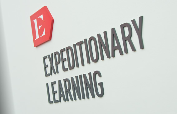
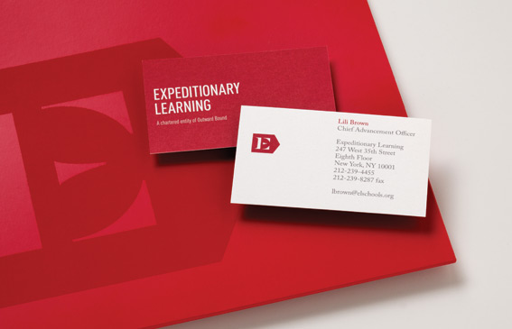

A bold new color — crimson — that reflects the organization’s roots at the Harvard Graduate School of Education, a new typographic palette, and the tagline “Thinking in a New Direction” helped give further meaning to the symbol and articulate their approach to school reform.
Example: Stadion Money Management
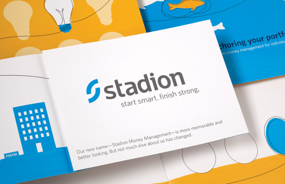
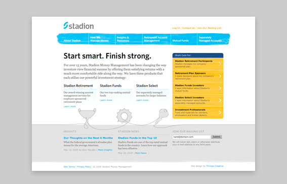
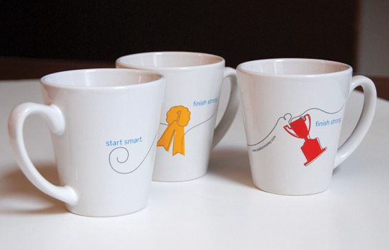
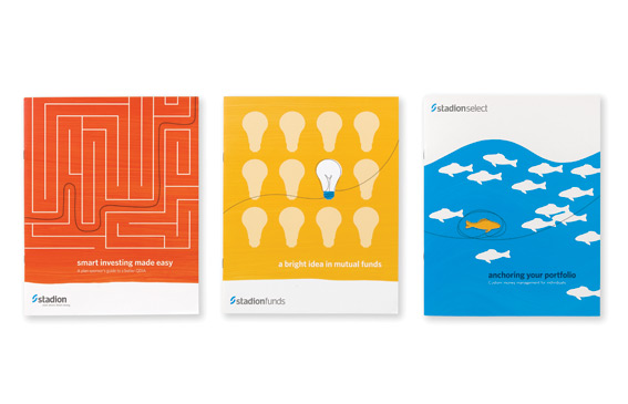
We created a bright palette and friendly illustration style to build an engaging and differentiated context in which the simple logotype lives. The tagline “Start smart. Finish strong.” relates to their business of long-term investing as well as the content of the illustrations.
4. “In order to look like a serious player, I need a logo similar to my competitors’ logos.”
Nothing could be further from the truth. The reason for investing any time or money at all in branding is to accentuate the differences and benefits of your organization through engaging visuals that set you apart from your competition. A “me-too” approach to marketing not only shows a lack of imagination, but it’s generally less effective as well.
Example: Finish Line Physical Therapy
![]()
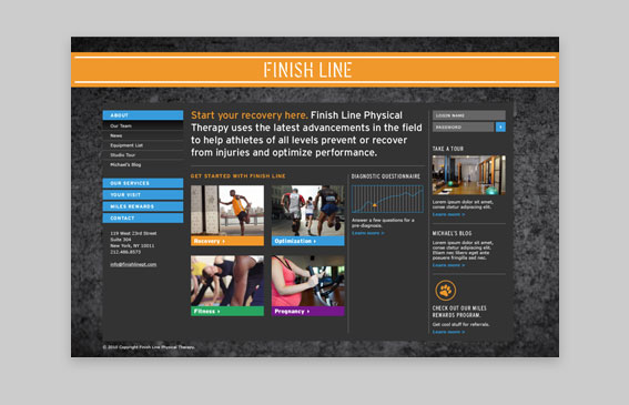
Finish Line is a New York City physical therapist specializing in the treatment of athletes. Thinkso took cues from the world of sports, and the unique environment of the NYC urban athlete to create a look that is very different from the typical health care/spa vibe that most physical therapy offices evoke.
5. “There’s a one-size-fits-all approach for logo design.”
Absolutely not. Every company’s differentiating traits, market space, and resultant needs are different, which is exactly why Thinkso does a full evaluation and analysis of your organization’s strengths, challenges, and overall competitive landscape before launching into any identity work.